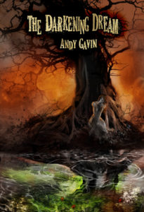
 Even after the product launch has begun, I’m still tinkering — and such is the way of it in the new world of agile product development. My current cover (to the left) now has an awesome image, but the overall effect isn’t quite bookish enough. So in the interest of total transparency (or mind numbing boredom?) I’ll continue to let you in on these intermediate steps of the creative process.
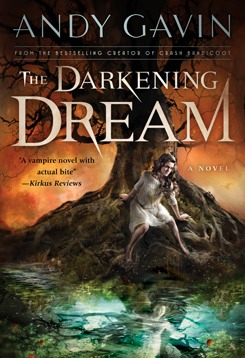
My cover designer, Pete Garceau, has whipped up a couple concept sketches. To the right is a darker colored take and below one in the original color scheme. You can click them to embiggen.
These are NOT in any way finished. Just concepts.
What I want to know for you, reader, is:
1. Which color scheme do you like, and why?
2. Your opinion of The Darkening Dream font/logo?
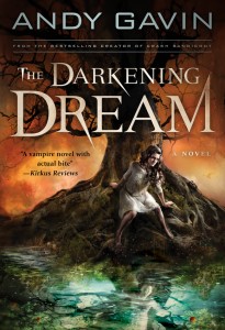
Please let me know in the comments!
Discover more about my novel, The Darkening Dream here or on all sorts of other links in the left sidebar.
It’s worth noting, that in the specialized world of book design the book designer (interior), the cover designer (logo design cover layout), and the illustrator (who paints the image on the cover) are sometimes all different people!
NOTE: I updated this post at 10:43am PST with slightly newer takes on the covers. The “older” two can be found here and here.





 Alex Kosmitoras may be blind, but he can still “see” things others can’t. When his unwanted visions of the future begin to suggest that the girl he likes could be in danger, he has no choice but to take on destiny and demand it reconsider. Farsighted is the winner of the 2011 Dragonfly eBook Awards. Get it on


