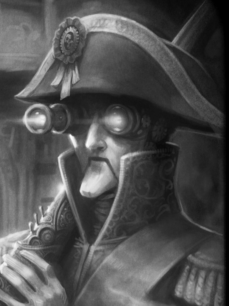
My upcoming novel, Untimed, features an amusing cast of characters, so I gathered up their likenesses into a rather oddball “family” album which can be found here.
- Writing
- Books
- Games
- Movies
- Television
- Food
- Food Review Index
- Foodie Club
- Hedonists
- LA Sushi Index
- Chinese Food Index
- LA Peking Duck Guide
- Eating Italy
- Eating France
- Eating Spain
- Eating Türkiye
- Eating Dutch
- Eating Croatia
- Eating Vietnam
- Eating Australia
- Eating Israel
- Ultimate Pizza
- ThanksGavin
- Margarita Mix
- Foodie Photography
- Burgundy Vintage Chart
- Other
- Gallery
- Bio
- About
- Contact
Archive for Illustration
From Sketch to Final
Dave Phillips, the awesome artist I commissioned to illustrate my time travel novel, Untimed, has been quietly cranking away. A couple of weeks ago he finished the rough versions of all twenty-one images. I thought I’d use this post as an opportunity not only to show off his brilliant work, but to shed some light on the process. The images on the left are the roughs, and on the right the finals.
We use the roughs to establish composition and for me to check that all the details are consistent with the novel. I give him feedback and he then spends the time to polish the image up. Neither of these images required any major changes, but it’s fun to see both how well the rough makes an impression, and how much more detailed the final is.
To get a close up look at this, click one of the images and it will bring up a Smugmug lightbox. You can then use the arrow keys to flip back and forth between the images, including between the rough and the final to see the differences.
This particular image, released previously, shows the mysterious Tick-Tock gloating over a dying Ben Franklin — oops!
And this new one occurs 80 years later across the English channel. Ever wonder if you’d like yourself? Time travelers can find out first hand. Or, perhaps, meeting yourself will destroy the very fabric of the spacetime continuum!
Untimed – Meet the Tocks
 I finished the line editing on my second novel, Untimed, last December, but that doesn’t mean the work is really over. On one front, it’s out to various agents and editors, but on the other I’m working on spit and polish.
I had it professionally proofread and just finished going over all those little fixes. This is just an extra step to make sure it’s as free of errors as possible and that the comma, hyphen, and spelling niceties are as consistent as possible. And apparently I don’t like commas half as well as I should.
But far more exciting is that I’m having the book illustrated! I know it’s relatively rare to illustrate novels, but I love art and believe — well done — that it really adds to the overall experience. Working with the agent who represented the awesome cover artist for The Darkening Dream, I found a talented illustrator named Dave Phillips (his website is here and some portfolio samples here). He has a real knack for character (see this for example) and knows how to capture lifelike personality in his figures. Over the last few weeks we’ve been developing character designs and now the first (more or less) finished image.
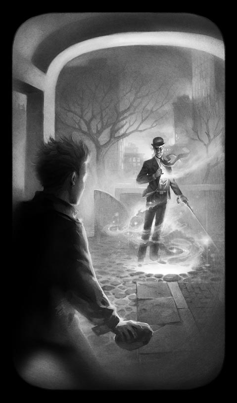
To the right, our hero Charlie (in front), confronts the mysterious Tick-Tock, a rapier-wielding clockwork man who serves as the only link to Charlie’s missing father.
But Tick-Tocks are full of surprises, including the ability to punch holes in time!
Two free Naughty Dark tickets to the first reader who guesses the exact physical location of the scene (reply in comments here). You must not be one of my beta readers or one of their relatives. Hint: “Ghost H…”
Cover Commission
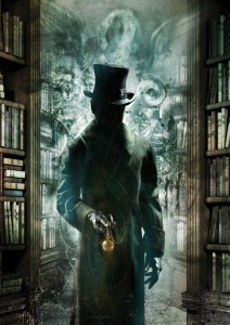
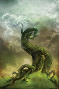
I’ve officially signed a cover artist for The Darkening Dream. His name is Cliff Nielsen and he’s a very experienced artist using a cool ethereal multimedia style. You can check out his work on his website but I pasted two into this post. I originally found him though this image of the dude with the watch. I was searching the web for “clockwork men” since the villains in my second novel, Untimed, are… you guessed it… clockwork men. Google brought up this image and I had to find out who the artist was. Then I discovered I already owned a decent collection of books he drew the covers for (e.g. City of Bones, which I reviewed recently).
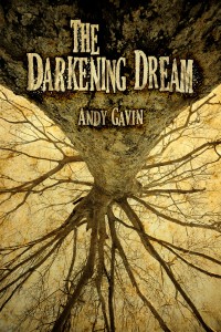
A lot of covers these days are just simple photos (like my homebrew tree cover below) or stenciled vector art. But I’ve always been partial to “painted” covers, so in researching cover design options I kept coming back to commissioning an original illustration. Perhaps it’s because of my early years as a 70s and 80s Science Fiction and Fantasy reader, where nearly every cover was painted. Back then, photographic covers were always a sign of some cheesy film tie-in.
In any case, Cliff’s art resonated well with my own style. Although it must be noted that the above clockwork man is far too 19th century for the mysterious “Tick-Tocks” in my second book (who blend their outfits into whatever era they visit), but it’s still a great image and very evocative.
So Cliff is reading/skimming the book and I hope to have some content sketches back shortly. I can’t wait. One of the best things about working with artists (and I was fortunate to have worked with dozens of great ones at Naughty Dog and my other companies) is seeing your ideas realized in a visual form.
For an interview with Cliff, and a photo, see here.
For more information on The Darkening Dream.
For more posts on writing, click here.
Related posts:
Copyright © 2026 All Rights Reserved

