So what was it that Sega and Nintendo had in 1994, but Sony didn’t?
An existing competing mascot character. Sega had Sonic and Nintendo had Mario (even if the N64 was just a rumor at that point). But Sony product slate was blank.
So we set about creating a mascot on the theory that maybe, just maybe, we might be able to slide into that opening. I’m still surprised it worked.
Next we had to find a creature to hang our hopes on. We wanted to do what Sega had done with the hedgehog and Warner Bros had done with the Tasmanian Devil and find some kind of animal that was cute, real, and no one really knew about. We bought a copy of “Tasmanian Mammals – a field guide” and flipped through. The Wombat, Potoroo, and Bandicoot fit the bill. For the meantime we went with Willie the Wombat, as both Jason and I like alliteration. We never considered it a real name as it was too dorky. And just a month or so later someone told us about some other non-game property with the same name, so it remained a working title. By October 1994 the character was a Bandicoot as far as we were concerned. We loved the word, but we kept calling him Willie, and the game Willie the Wombat until spring of 1996. It wasn’t really worth it to sort out a final name – some marketing department would probably change it anyway.
In September and October of 1994 we were busy trying to figure out who this Willie guy was. We felt he should be goofy and fun loving, and never talk — on the theory that voices for video game characters were always lame, negative, and distracted from identification with them.
But the villain gelled faster than the hero.
I remember it clearly. The four of us were eating at this mediocre Italian near Universal and I had this idea of an evil genius villain with a big head. Obviously brainy cartoon villains have big heads. He was all about his attitude and his minions. Video games need lots of minions. Jason had become very fond of Pinky and the Brain and we imagined a more malevolent Brain with minions like the weasels in Who Framed Roger Rabbit. A villain, all full of himself, unable to conceive of ever doing anything the simple way, but constantly (in his eyes) betrayed by the incompetence of his henchmen.
I put on my silly villain voice and intoned, “If you had three neurons between you, you couldn’t make a triangle!” With this attitude, his name, Doctor Neo Cortex, popped instantly into our heads.
For “Willie” was to be – in our minds – a game that tried to combine the game play of Mario or Donkey Kong Country with the animation and cartoon sensibility of a Looney Tunes or Tex Avery cartoon.
To that effect, we took the very unusual step of hiring real “Hollywood” cartoon designers to help with the visual part of the production. This was Mark’s idea at first, although Jason and I saw the brilliance of it immediately. In those days we were enamored with the idea blending the best of Hollywood into game making – creative synergy if you will. In the long run, we would be disabused of much of the synergy notion. However, production design, sound design, voice acting, and later motion capture, were to be the areas in which Hollywood resources proved valuable to video game teams.
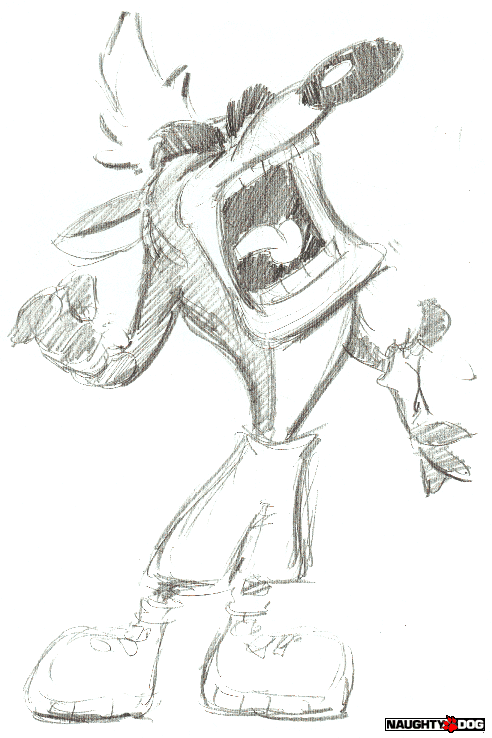
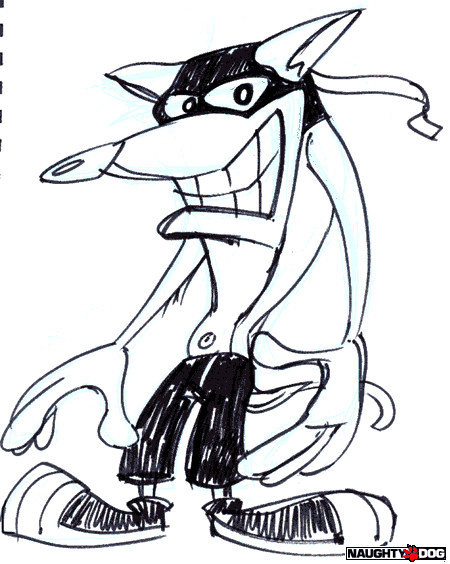
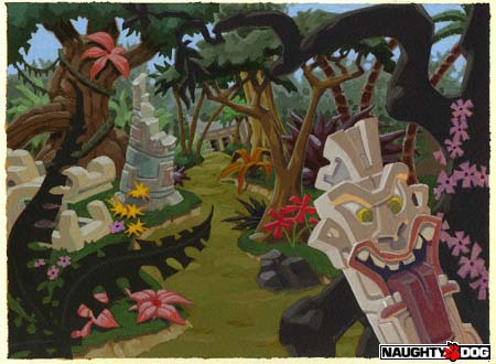
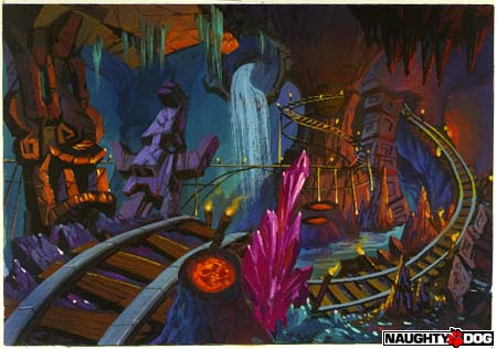
The guys we brought on were Charles Zembillas and Joe Pearson. Charles was principally character, and Joe background. These two were instrumental in developing the look of Crash Bandicoot, particularly prior to us hiring Bob Rafei in January 1995. Bob was an extremely talented young artist who would eventually come to head the art design at Naughty Dog. But in 1994, what Charles and Joe did was provide the fleshing out, or visualization, of ideas pitched mostly by Jason, myself, or Mark. In essence, they translated into cartoon sensibility.
Charles in particular was a very fast sketch artist, with a real knack for capturing cartoon emotion. So we would just say things like, “Cortex has a huge head but a tiny body, he’s a mad scientist, and he dresses a bit like a Nazi from the Jetsons” and in 2 minutes he’d have a gray and blue pencil sketch. We might then say, “less hair, goofier, crazier” and he’d do another sketch. Repeat.
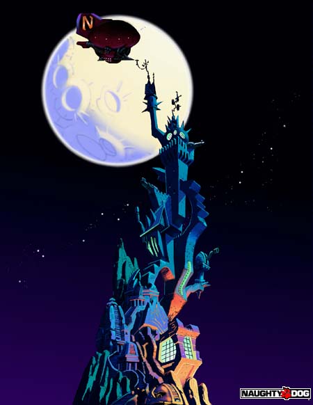
Joe did the same for the backgrounds, but as landscapes have more lines, on a slightly longer time scale. Given that “Willie” was Tasmanian we set him on a mysterious island where every possible kind of environment lurked. Evil geniuses like Dr. Cortex require island strongholds. So we had lots of environments to design. Jungles, power stations, creepy castles, evil natives, sunset temples, spooky caves, etc. At some point early on we hit on the “tiki” idea and thus: goofy Easter Island tikis everywhere.
Jason’s comments:
When we started designing Crash, or Willie as he was first known internally, we decided that there need be no connection between the real animal and the final design — hey, all mammals, uh marsupials. A Wombat looks nothing like Crash. He is closer to a Bandicoot, maybe, but that was pure luck. Instead the design of the character was determined 51% by technical and visual necessity and 49% by inspiration.
A (very) partial list of the Necessities:
Why is Crash Orange? Not because we liked it, but because it made the most sense. First I created a list of popular characters and their colors. Next I made a list of earthly background possibilities (forest, desert, beach, etc.) and then we strictly outlawed colors that didn’t look good on the screen. Red, for example, tends to bleed horribly on old televisions. At the time, everyone had old televisions, even if they were new! Crash was orange because that was available. There are no lava levels, a staple in character action games, because Crash is orange. We made one in Demo, and that ended the lava debate. It was not terribly dissimilar to trying to watch a black dog run in the yard on a moonless night.
Why is Crash’s face so large? Because the resolution of the screen was so low. Some people think we were inspired by the Tasmanian devil. Perhaps, but it was the necessity of having features large enough to be discernable that caused us to push for the neckless look. The move made it a little harder to turn his head, and created a very unique way of moving, but it let you see Crash’s facial expressions. And that was to be very important.
Why does Crash have gloves, spots on his back, and a light colored chest? Resolution, bad lighting models, and low polygon counts. Those small additions let you quickly determine what part and rotation of Crash you were looking at based on color. If you saw spots, it was his back. Yellowish orange was the front. As the hands and arms crossed the body during a run the orange tended to blend into muck. But your eyes tracked the black gloves as they crossed Crash’s body and your mind filled in the rest.
We were wrestling with these design constraints the entire process. Joe and Charles, with all their talent, were free to do anything that they could imagine on paper. But Bob and I were the artists that eventually had to ground that back in the reality of calculator strapped to a TV that was the PlayStation 1.
Charles would hand us a sketch and we would start the math: 240 pixel high screen, character 1/6 to 1/4 of the screen height, character 40 to 60 pixels high, proposed hat 1/8 of height of Character, hat 5 to 6 pixels high, hat has stripes. Striped hat won’t work because the stripes will be less than 1 pixel high.
Take the image Andy posted titled “A Crash that Wasn’t.” I can tell you immediately that the tail and any kind of flappy strap was immediately shot down because it would have flickered on and off as the PlayStation failed to have pixels to show it. And that little bit of ankle showing beneath the long pants would have been an annoying orange flicker every few frames around the bottom of his pants and shoes. Shorter pants would have to prevail. Crash did end up with a belly button, but it would be about 2x as big.
Charles would look at us like we were speaking Swahili. But then he’d go off and draw something totally cool and all would be well.
Cortex had few of these issues. We could make him totally improbable, un-animatable, and just keep him bigger on the screen. He didn’t show up too often anyway. He could never really walk with those short legs. He had to do a weird thrusting tra-la-la dance. But he looked cool so we just kept him stationary most of the time.
Cortex was my favorite. I think Andy preferred Crash. They fit our differing personalities! Andy has the original ink Crash sketches and I have the original Cortexes. Both are a true testament to Charles Zembillas’ skill as a character designer. [ NOTE from Andy: I love both, but I too have a secret fondness for my brainchild — he’s just funnier, and he takes himself way too seriously to ever dress in drag. ]
CONTINUED HERE WITH PART 3 HERE or
| If you liked this post, follow me at:
My novels: The Darkening Dream and Untimed |

