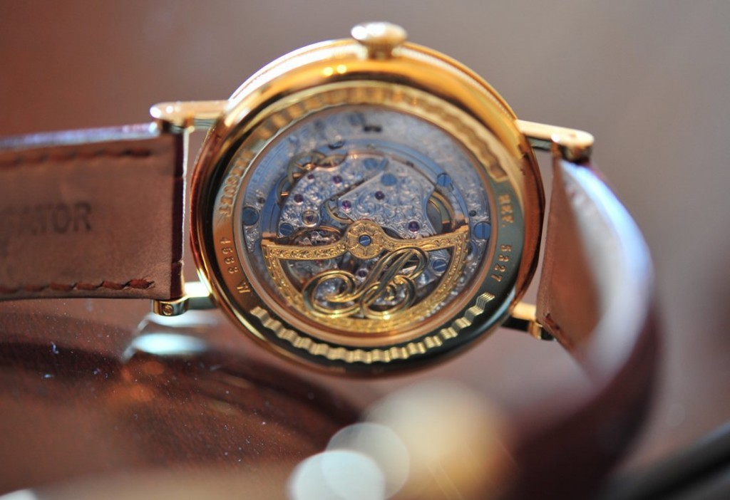
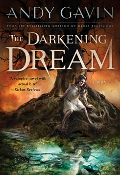
A while back, Cliff Nielsen, the amazing artist who created the cover for The Darkening Dream, finished the amazing new cover painting for my second novel, Untimed. This is going to replace the stock photography clock cover to the left, but I’m not ready to reveal it (I will in a week or three) but I’ve been experimenting with logos and wanted to collect your opinions. As a side note, I’ve been doing my mechanicals myself. Not only is it cheaper, but my photoshop skillz have gotten moderately elite — at least for a programmer/author.
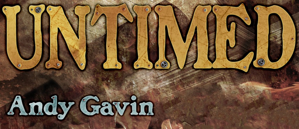
Below are three takes on the logo. You can even see just a hint of the cover illustration here, but I cut it tight to be a tease (and content aware filled out a bit of someone’s head!).
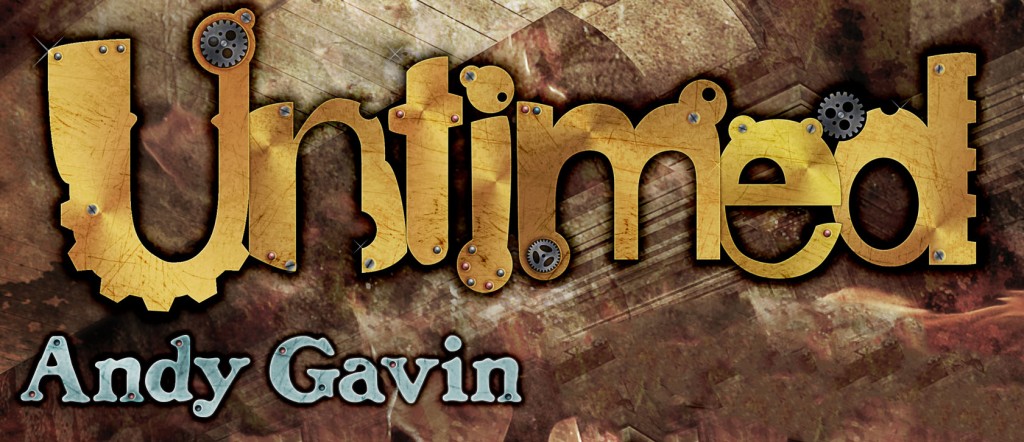
A fairly heavily “styled” version where the text is inspired by antique clock parts (this is after all a time travel novel with clockwork killer machines). Thanks to longtime friend Jason Rubin for help on an earlier variant of this logo.
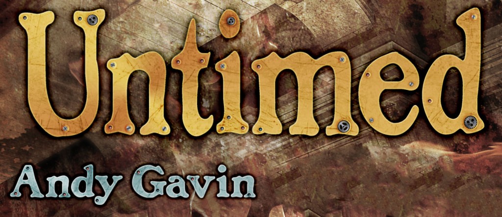
A similar brass treatment, but using a more strait forward lowercase type treatment. The font is modeled after an 18th century typeface.
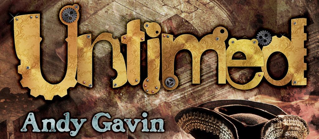
Similar to the top-most one, but with arabesque tooling in the metal instead of brushing. This new variant was added 9/12/12, after most of the comments. Since people liked #1, I wanted to work in that direction.
So, dear readers, which version do you like? Let me know in the comments. None of the above is a viable opinion, but please give reasons.

